You may have seen the awesome pac-man game on Google homepage on May 21st, a nice way to pay homage to the game’s anniversary.
What you may not know it that it was a real game, one that users could play (and that, according to the Rescue Time Blog, it “cost” around 4.82 million hours of time spend playing rather doing others more boring things). :D
If like me you tend to use the google search bar imbedded in your navigator and didn’t caught the game on Friday, fear not, it is now online at http://www.google.com/pacman/, you just have to click “insert coin” to fall prey of the joys of procrastination.
If you have lived under a rock the past few months, you may not be aware of Logorama, the short film who won the 2010 Oscar of the best animated short film. Logorama was created by the French animation collective H5, François Alaux, Hervé de Crécy & Ludovic Houplain, and its main characteristic is that all characters & objects used in the film are made of logos and brands names. The bad guy is a gangster Ronald MacDonald, and a giant, well, Green Giant looks over a zoo inhabited by Linux penguins, Lacoste crocodiles and WWF pandas among many others…
The scenario is a bizarre mix of classic cops movies and disasters films, full of stereotypes and references, with a nihilist 2012 flavour.
The film has been online on and off since the Oscar, and I only saw today the full French version, dubbed by a well known duo of French comics, Omar & Fred. The translation is far from literal (especially the discussion between the two Michelin Bibendums cops: instead of talking about the zoo they discuss yoga, chakras and the sex life of one of them), but at the end as nonsensical as the English version.
The incredible accomplishment of this irreverent movie is without a doubt the use of so many brands as characters, making them public domain, giving them new personalities and finally destructing them all.
As I doubt McDonald authorized the use of Ronnie as a crazy gun-dealer shooting Bic kids in the street, it is fair to guess that none of the brands were asked their advice before the making of the movie.
The goal of many brands today is to become part of the conversation, part of the daily life of consumers. And so, can they really complain when their personality of their symbols is so well established that they can be hijacked to create this sort of work?
Well, sure they can (and they probably will), but such is the price of fame, and in this case, the creative transformation is so evident that I can’t think any brand would won against Logorama, (nor walk away from trying way more damaged than it ever was by the movie.)
The goal of our second long-term design project, overseen by Ruth Sykes, also from Reg Design, was to create a call to action, through the design of a poster and a supporting item.
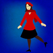
I chose to communicate on the matter of disposable paper cups. The goal was to make people change their behavior and use a travel mug rather than the averages paper cup that always ends-up in the trash.
The name of the campaign, Mug-up!, is voluntarily bossy, and works with a more playful line that justify the call to action.
In order to sensibilise people on the matter, I showed an overdramatic result of the use of cups. Playing on the huge quantity of paper cups that end up thrown away everyday, I chose to humanize them, making the threat more tangible.
The poster plays on this spooky aspect with dramatized light, sharp contrasts and green overtone evocative of danger and horror movies.
The item is complementary to the poster and used to reach the people whose behavior needs to change (i.e. people using take-away cups), catch their attention. To achieve that it uses the usual dressing of the paper cups: a cardboard sleeve to protect from the heat, and a small cardboard disc fixed on the lid of the cup.
As the campaign is non-profit, it could be global and the customized sleeves and lids would be available with all take-away beverages, no matter the brand: Starbuck, Costa… All would participate, helping to increase the awareness on the subject and acting as a trigger to make people change their habits.
This year design classes were eventful, and apart from many small assignments we worked on two long-term projects. One of them, overseen by Emily Wood from Reg Design, was entitled "Everyone I've ever known".
The brief was to find a way to classify the people in our lives and to convey those information through a poster.
In “Where are you? (in my life)” I chose to illustrate how the divers social circles overlap with one another, mapping the mains groups of people through the way we met and their place in my personal landscape. The customisable tags “… is here” ad an element of playfulness and interactivity to the poster by allowing people to place themselves in the precise overlapping area they are in.
On the subject of designing a visualisation of complex informations or numbers, the website Designing the News is an interesting and plentiful resource.
Britishness has many icons, from the emblematic double Decker to the daily cup of tea (even thought the English are now a nation of coffee drinkers.)
Some icons are obvious, others less so (the website Icons, a portrait of England, is a great resource on the subject). But when in doubt of an icon status, there is usually an incontestable argument: whether or not the object of the debate has been plagiarized, used as a reference or made fun of.
The “Keep Calm And Carry On” poster was created during the Second World War by an unknown British designer and never actually published. However, it was rediscovered, and during the second half of the 20th century was plastered all over merchandizing, mugs and sheets, and became one of those icons I was talking about.
One could wonder about the reason of this craze around what is in all objectivity a fairly basic poster (even if undeniably visually very strong). For myself, I think this poster has two major strengths as well as a third lesser one:
- The color. Whether it be roses, double Deckers, phones booths or the pillar boxes of the Royal Mail, red is the emblematic colour of England, no arguing about that.
- The text. “Keep Calm And Carry On” is not only a very powerful line, it’s also the embodiment of the British spirit. It’s all about the infamous composure of the British gentleman, but also a tribute to the determination and calm resiliency of a whole people.
- The Crown. No United Kingdom without the Royal Family. The poster wouldn’t work half as well without this discrete warrant of royalty.
And as I said before, all those elements that make this poster great have been used, referenced and played with in every way possible.
Once at a poetry reading I saw a book cover referencing it. I myself has used it for the introduction part of a presentation during a debate on which outdoor advertising was the best: the French’s or the British’s?
I was obviously on the British side.
I also came across those mugs at Selfridges. They played with the three elements I was talking about, and yet the reference is still very obvious. :)
Those are just a few example of the ways an icon can be used to convey a new message, using what the viewer know about it and taping in all the subconscious associations in order to deliver a strong idea.
I am currently an A.D. living in Paris. I started this blog while staying in London as a student, then continued it when I moved to Bangkok for an internship and I am now back in Paris, with no plan to stop blogging.
The Advertising Eye will be a place for me to share my thoughts, observations and analysis not only about advertising but also more widely about anything graphic, creative or related to communication.