04/04/2011

Art Drop

Because those days I'm quite overworked (and also kind of lazy when I'm finally home), this is an art drop from one of my three visits at the Musée d'Orsay in Paris a few month back.
I love visiting museums with a sketchbook at hand, it forces me to look differently, to look deeper, to look, somehow, more than I do when I'm just strolling around from one painting to another.

Click to enlarge the sketchs.


Some animals by French sculptor François Pompon.


Young man.


Hermès leaning on a pillar.


Ravachol and Chauchard, two small satirical plaster cast by Fremiet.


A young faun feeding bear cubs.


Bourguereau's Dante et Virgile, which I find incredibly powerful and evocative despite the obvious excess of the composition and the slightly wrong anatomy.

21/02/2011

R is for Reference

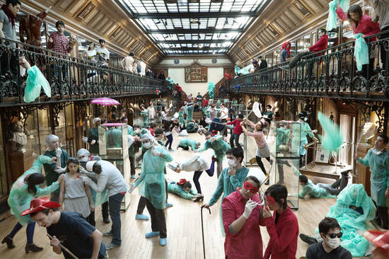
Today I bring to you a very referential, fun and ambitious photography project: Où est Charlie ?, “Charlie” being the French version of the infamous lost reporter Wally (or Waldo, depending on which side of the Atlantic ocean you are).
And this time, Charlie (or Wally or Waldo) is live, hidden in the crowd of 14 large-scale pictures taken by a duet of photographers from the Goblin School: Max & Charlotte. (Go on Fubiz for a full view of the project and bigger versions of the pictures.)


The work is impressive, really fun and playful. However, I find really interesting and quite fascinating that the reference of a well-known children book is what's give the project its real interest. It wouldn't have been so attractive if it had been all about Where is John?


Whether it be some king of tribute, parody, or plain passing reference, pop culture gave us an enormous pool of common references to draw from, ranging from allusions to Star Wars or the Flash in Queen songs, to lines from beloved books, songs or movies, or visual symbols from world famous paintings.
Some of it is culture and generation specific, but what matters is that the use of common references seems to increase the 'value' and the enjoyment drawn from a creative project, as long as it still qualify as 'reference', and not the loathed ''plagiarism'.

But why is that?
There must be studies out there, backed-up with data giving supported answers (if you know of any, please share), but for myself I find at least two obvious answers.

1) References are comfort. They are easy, and give you, well, a point of references rather than throwing you cold turkey into a movie (or artwork, or song, or anything else) without any key to understand it. They give a welcome measure of familiarity, an indication or a starting point to analyze it.
In some ways, it's the same mechanism as symbolism; only references are not used as some kind of alphabet, with clear signification attached to each reference. They are more usually playing as a piece of common background, sometime obvious, sometime less so, used as an anchor.

2) The "common background" thing is the second part of the answer. It's a commonplace analysis that humans are social animals, and that they like to be part of a community. It's one of the pet principles of marketing guru Seth Godin: Tribes. In this regard, the use of references is like a secret password, a way to say: we like the same things, you and I, look, we share the same references. (And also: see, if you liked this *insert reference*, then you must like this too…)
Freemasons had complex symbols incorporated in paintings, teenagers have their secrets hand-shakes, and many, many people have quotes from Fight-Club, or citations from a philosopher, or Big Bang Theory references, or mention of a sport event and so on… As long as it ties them to a Tribe.

For an advertising person, a well handled reference is simply pure gold.


04/02/2011

3515 Google

Remember, remember, the 5th of Nov...  before the internet, when for french people, looking for any information meant either going to the public library, buying a newspaper, or turning on the Minitel...
Yes, the Minitel, this beige box sitting near the phone with it bichromic pixel screen and access codes.

Google, with it's usual playfulness, created an access page untitled 3615 Google, mimicking the old Minitel entry page.
Photobucket

Capitalizing on nostalgia is almost always an useful move and I have to say, I like what Google did this time.

18/01/2011

Branding stories

We all know that when a brand changes it's logo, this is not the reaction they get (unless you're a marketing/graphic design/com person or some kind of lunatic).

(Pic curtesy of the fun tumblr "Things Real People Don't Say About Advertising".) 

However, when the brand is famous, or well-loved or both, the change doesn't go unseen.
Recently, two big brands took a leap and changed -or modified, in one of the cases- their logo : Gap and Starbuck.

For it's 40th birthday, Starbuck went the simplification way, by getting ride of the ring with it name in it, keeping only the two tailed mermaid and going back to its roots by returning to a monochromatic design.
Photobucket 
The move toward a simpler design is far from being an unprecedented trend for a brand, and there are many example of the process. The evolution was also brought by the current strategy of Starbuck: the brand has been diversifying for years now and doesn't want it's logo to single-out the coffee-selling part of the business.
However, I personally find the choice to drop the name from the logo a clumsy move, as it weakens the brand recognition. Sure, it is not a problem in some places, were there is a Starbuck at every corner and everyone knows what the green mermaid on a cup stands for, but for countries where the brand isn't as well recognized like France, this new logo could prove damaging.
Others arguments against the logo as the symbol of the brand extension strategy are made over there at bnet by Geoffrey James, and those make sense as well. By cutting away the "coffee" to expand it's brand signification, the core activity becomes muddled and the global signification of the brand is only weakened and made unfocused.


Way more controversial than Starbuck's more sober logo is Gap's rebranding.
On october last year, the brand stirred one of those flamestorm the internet is famous for when it unveiled this new logo.
Photobucket
Unarguably uninspired (it would be difficult to do more bland than some Helvetica with a blue square), the new logo excited rather vigorous protests online. A discontented internet user with a knack for programming created a  "Crap Logo" generator, dozens and dozens (and dozens) of cybernauts posted their own suggestion of rebranding.
Photobucket
The one good point on Gap's side is that they were very reactive, communicating through their Facebook page.
But the uproar was such that after a few feeble attempts at pretending the new logo was the start of a crowd sourcing project, the company finally backtracked, and "after much thought, decided to go back to (it's) iconic blue box logo”.
Well, at least the Doctor would approve. You can't go wrong with a blue box.


So, what do you think? Hidden genius or tragic fail?


Morgan Girls

An other post from my secret stash of past projects, this time a work for a new concept store.
Giving Caesar his due, it was a team effort, with my classmate Roseline Veujoz.

You may be familiar with the brand, Morgan, and for those who are not, they are specialized in women clothes.
After studying the brand DNA, we realised that this was the most important thing to know about the Morgan-Girls : they are confident, captivating and sexy, ready to go after what they want...
In fact, they are not unlike the James Bond girls !
And here was our concept.

Photobucket

Red, steel and black are their colors, and the store was to emphasize this aspect, as well as their clean certainty and their cutting-edge seductiveness, using shapes like the spiral or the iris, the confort of a world where they have the power.

Photobucket

Photobucket

Photobucket

What was meant to be a one-shot store concept is strong enough to morph into a co-branding venture, or even a full scale advertising campaign concept.