Showing posts with label analysis. Show all posts

21/02/2011

R is for Reference

Today I bring to you a very referential, fun and ambitious photography project: Où est Charlie ?, “Charlie” being the French version of the infamous lost reporter Wally (or Waldo, depending on which side of the Atlantic ocean you are).
And this time, Charlie (or Wally or Waldo) is live, hidden in the crowd of 14 large-scale pictures taken by a duet of photographers from the Goblin School: Max & Charlotte. (Go on Fubiz for a full view of the project and bigger versions of the pictures.)
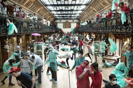


The work is impressive, really fun and playful. However, I find really interesting and quite fascinating that the reference of a well-known children book is what's give the project its real interest. It wouldn't have been so attractive if it had been all about Where is John?


Whether it be some king of tribute, parody, or plain passing reference, pop culture gave us an enormous pool of common references to draw from, ranging from allusions to Star Wars or the Flash in Queen songs, to lines from beloved books, songs or movies, or visual symbols from world famous paintings.
Some of it is culture and generation specific, but what matters is that the use of common references seems to increase the 'value' and the enjoyment drawn from a creative project, as long as it still qualify as 'reference', and not the loathed ''plagiarism'.

But why is that?
There must be studies out there, backed-up with data giving supported answers (if you know of any, please share), but for myself I find at least two obvious answers.

1) References are comfort. They are easy, and give you, well, a point of references rather than throwing you cold turkey into a movie (or artwork, or song, or anything else) without any key to understand it. They give a welcome measure of familiarity, an indication or a starting point to analyze it.
In some ways, it's the same mechanism as symbolism; only references are not used as some kind of alphabet, with clear signification attached to each reference. They are more usually playing as a piece of common background, sometime obvious, sometime less so, used as an anchor.

2) The "common background" thing is the second part of the answer. It's a commonplace analysis that humans are social animals, and that they like to be part of a community. It's one of the pet principles of marketing guru Seth Godin: Tribes. In this regard, the use of references is like a secret password, a way to say: we like the same things, you and I, look, we share the same references. (And also: see, if you liked this *insert reference*, then you must like this too…)
Freemasons had complex symbols incorporated in paintings, teenagers have their secrets hand-shakes, and many, many people have quotes from Fight-Club, or citations from a philosopher, or Big Bang Theory references, or mention of a sport event and so on… As long as it ties them to a Tribe.

For an advertising person, a well handled reference is simply pure gold.


22/06/2010

The times they are a-changin'

As you may have noticed the Advertising Eye underwent a few changes in subtitle and icon.
The reason is simple : I have moved from the UK (I won't lie, I already miss London) to Thailand. Bangkok to be more precise.
So the overdressed icon is gone in exchange for a less color-sensitive (red is not exactly the rage these days in Thailand) and more climate appropriate one.

I am in Bangkok for a bit less than two months now, doing an internship as an AD in the branding agency Creative In-House.

And being in Bangkok, it is difficult too ignore the more or less visible damages of the recent crisis.
The city went back to normal looking really fast. The street have literally been scrubbed by an army of volunteers the week-end after the end of the Red's Shirts occupation, Lumpini park is back to normal, all damaged plants have been replaced, but some traces remain, the more obvious being the burned dent in Central World, one of Bangkok biggest and most famous shopping center (well, it was still visible when I arrived last week, now it's hidden behind a big fence).
But the effects are not only material. Without even talking about longer term effects on political considerations, the fallout of the crisis in this normally peaceful country are still felt. It was a hard blow on the Thai economy, (in fact the first agency I was meant to do my internship with moved to Cambogia for the rest of the year, "just in case") and most of the big hotels in Bangkok are still almost empty. Even in the more Thai oriented-districts and on streets usually packed on friday night, half the club remain closed…

The thing is, Thailand usually very positive image as taken a serious blow (well, it still can't be worst than the one BP is going through).
In the "Nation" newspaper of last week, Branding professional Brenda Bence wonders if the country can recover from it.
Now I'm not an expert, but I do think it can, at the condition that nothing similar happens again. Tourism-wise, all positive associations with Thailand are still there, as well as the physical proofs, from the smiles to the heavenly beaches through all the cultural history, temples and various national parks. People forget easily (or don't pay attention to the news), and if everything stay calm the farangs should be back soon.
Regarding the foreign investors my guess is that it will probably be more difficult, but far from impossible: the country still have all the facilities and the trained manforce that were part of it's success. Thailand still has good long days ahead of being a shinny destination.

01/05/2010

I is for Icon.

Britishness has many icons, from the emblematic double Decker to the daily cup of tea (even thought the English are now a nation of coffee drinkers.)
Some icons are obvious, others less so (the website Icons, a portrait of England, is a great resource on the subject). But when in doubt of an icon status, there is usually an incontestable argument: whether or not the object of the debate has been plagiarized, used as a reference or made fun of.

The “Keep Calm And Carry On” poster was created during the Second World War by an unknown British designer and never actually published. However, it was rediscovered, and during the second half of the 20th century was plastered all over merchandizing, mugs and sheets, and became one of those icons I was talking about.
Photobucket
One could wonder about the reason of this craze around what is in all objectivity a fairly basic poster (even if undeniably visually very strong). For myself, I think this poster has two major strengths as well as a third lesser one:
- The color. Whether it be roses, double Deckers, phones booths or the pillar boxes of the Royal Mail, red is the emblematic colour of England, no arguing about that.
- The text. “Keep Calm And Carry On” is not only a very powerful line, it’s also the embodiment of the British spirit. It’s all about the infamous composure of the British gentleman, but also a tribute to the determination and calm resiliency of a whole people.
- The Crown. No United Kingdom without the Royal Family. The poster wouldn’t work half as well without this discrete warrant of royalty.

And as I said before, all those elements that make this poster great have been used, referenced and played with in every way possible.

Once at a poetry reading I saw a book cover referencing it. I myself has used it for the introduction part of a presentation during a debate on which outdoor advertising was the best: the French’s or the British’s?
Photobucket
I was obviously on the British side.

I also came across those mugs at Selfridges. They played with the three elements I was talking about, and yet the reference is still very obvious. :)
Photobucket

Those are just a few example of the ways an icon can be used to convey a new message, using what the viewer know about it and taping in all the subconscious associations in order to deliver a strong idea.