Showing posts with label FAIL. Show all posts

18/01/2011

Branding stories

We all know that when a brand changes it's logo, this is not the reaction they get (unless you're a marketing/graphic design/com person or some kind of lunatic).
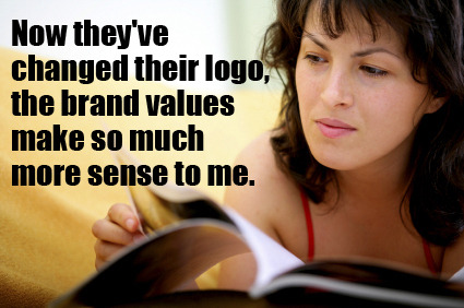
(Pic curtesy of the fun tumblr "Things Real People Don't Say About Advertising".) 

However, when the brand is famous, or well-loved or both, the change doesn't go unseen.
Recently, two big brands took a leap and changed -or modified, in one of the cases- their logo : Gap and Starbuck.

For it's 40th birthday, Starbuck went the simplification way, by getting ride of the ring with it name in it, keeping only the two tailed mermaid and going back to its roots by returning to a monochromatic design.
Photobucket 
The move toward a simpler design is far from being an unprecedented trend for a brand, and there are many example of the process. The evolution was also brought by the current strategy of Starbuck: the brand has been diversifying for years now and doesn't want it's logo to single-out the coffee-selling part of the business.
However, I personally find the choice to drop the name from the logo a clumsy move, as it weakens the brand recognition. Sure, it is not a problem in some places, were there is a Starbuck at every corner and everyone knows what the green mermaid on a cup stands for, but for countries where the brand isn't as well recognized like France, this new logo could prove damaging.
Others arguments against the logo as the symbol of the brand extension strategy are made over there at bnet by Geoffrey James, and those make sense as well. By cutting away the "coffee" to expand it's brand signification, the core activity becomes muddled and the global signification of the brand is only weakened and made unfocused.


Way more controversial than Starbuck's more sober logo is Gap's rebranding.
On october last year, the brand stirred one of those flamestorm the internet is famous for when it unveiled this new logo.
Photobucket
Unarguably uninspired (it would be difficult to do more bland than some Helvetica with a blue square), the new logo excited rather vigorous protests online. A discontented internet user with a knack for programming created a  "Crap Logo" generator, dozens and dozens (and dozens) of cybernauts posted their own suggestion of rebranding.
Photobucket
The one good point on Gap's side is that they were very reactive, communicating through their Facebook page.
But the uproar was such that after a few feeble attempts at pretending the new logo was the start of a crowd sourcing project, the company finally backtracked, and "after much thought, decided to go back to (it's) iconic blue box logo”.
Well, at least the Doctor would approve. You can't go wrong with a blue box.


So, what do you think? Hidden genius or tragic fail?


27/06/2010

Of the superiority of the Can over the Bottle

In Thailand, glass bottles are still returnable, against a fee.
This leads to a serious packaging problem for drinks coming in bottles : if you buy a bottle of, say, Pepsi on the street, the merchant will pour the drink into a bag, give you a drinking straw, and keep the bottle!
It can be... surprising the first time one come across this habit. ^^

Concrete proof :
Photobucket

Needless to say this is not good news for all the brands out there who spent a lot of money marketing and branding their pretty glass bottles… In Thailand at least, they should have gone for plastics ones, or cans!

24/02/2010

CommunicationFAIL

Let's say I got to see The Phantom of the Opera at her Majesty's Theater in London. So far, noting special.

The performance is great and inspiring, so when I come home, my first move is to update my facebook page to share the joy. Still nothing special.

The next move is (of course) to go on youtube and to dig a bit to pursue the enjoyment, listen again to some of the more emblematic songs, maybe find material to illustrate a potential blog post about it.
There, I find the official trailer of the show, posted by the theatrical company. It is well done, inspiring and makes me want to see the show again: perfect! It is exactly what I needed to propagate the love.

But here is the communication failure: the video embedding has been purposely deactivated. The trailer can't be directly posted on a blog. A facebook link will only give a nameless and captionless youtube link no one will click on.
This kind of comportment is quite common coming from official bodies, but it reveals an abyssal lack of understanding of the way the web 2.0 and it's users work.
By trying to keep the control of the content, the company is in fact killing in the egg any chance of propagation of the trailer and reducing greatly the potential word-of-mouth musicals -or any brand or product really- thrive on.

And so, what was going to be a "Brainfood: The Phantom of the Opera" post turned into a "CommunicationFAIL" post.
Sad isn't it?

10/02/2010

DesignFAIL

One of the frequents stops of my daily internet-tour is the wonderfully awful blog Photoshop Disaster.
Beware; you enter the realm of the random copy-pasting, the mad cloning tool of doom, the forgotten Llorem Ipsum and the “can’t you make her look less like a real human being with, you know, curves?”

Apart from the good laugh, I find this blog precious because it reminds me that:

- staring too long at a photoshop document is not good. After a while you don’t see the glaring, in-your-face mistakes anymore.
- proof-reading works with images too.
- clients asking for miracle pictures from scratch with absolutely no money to even buy good stock pic get what they deserve.
- “Dove: Evolution” has never been so true.
- I didn’t lose my time taking live model classes. Hey, I can tell that the “girl” in this picture can’t be real and thus is probably an untalented alien shape-shifter with a very loose grasp on human anatomy trying to make some pocket money. Being able to tell the difference is a useful skill to have in life.